Linking Interactive Notebooks
Evolve markdown documents and notebooks into structured data
MyST allows you to directly include Jupyter Notebooks in your books, documents and websites. This Jupyter Notebook can be rendered directly using MyST.
For example, let us import altair and create a demo of an interactive plot!
import altair as alt
from vega_datasets import data

source = data.cars()
brush = alt.selection_interval(encodings=['x'])
points = alt.Chart(source).mark_point().encode(
    x='Horsepower:Q',
    y='Miles_per_Gallon:Q',
    size='Acceleration',
    color=alt.condition(brush, 'Origin:N', alt.value('lightgray'))
).add_selection(brush)

bars = alt.Chart(source).mark_bar().encode(
    y='Origin:N',
    color='Origin:N',
    x='count(Origin):Q'
).transform_filter(brush)
We can now plot the altair example, which is fully interactive, try dragging in the plot to select cars by their horsepower.
points & barsLoading...
# https://matplotlib.org/stable/gallery/statistics/time_series_histogram.html#sphx-glr-gallery-statistics-time-series-histogram-py
from copy import copy

import numpy as np
import numpy.matlib
import matplotlib.pyplot as plt
from matplotlib.colors import LogNorm
# Make some data; a 1D random walk + small fraction of sine waves
num_series = 1000
num_points = 100
SNR = 0.10 # Signal to Noise Ratio
x = np.linspace(0, 4 * np.pi, num_points)
# Generate unbiased Gaussian random walks
Y = np.cumsum(np.random.randn(num_series, num_points), axis=-1)
# Generate sinusoidal signals
num_signal = int(round(SNR * num_series))
phi = (np.pi / 8) * np.random.randn(num_signal, 1) # small random offset
Y[-num_signal:] = (
np.sqrt(np.arange(num_points))[None, :] # random walk RMS scaling factor
* (np.sin(x[None, :] - phi)
+ 0.05 * np.random.randn(num_signal, num_points)) # small random noise
)
# Now we will convert the multiple time series into a histogram. Not only will
# the hidden signal be more visible, but it is also a much quicker procedure.
# Linearly interpolate between the points in each time series
num_fine = 800
x_fine = np.linspace(x.min(), x.max(), num_fine)
y_fine = np.empty((num_series, num_fine), dtype=float)
for i in range(num_series):
y_fine[i, :] = np.interp(x_fine, x, Y[i, :])
y_fine = y_fine.flatten()
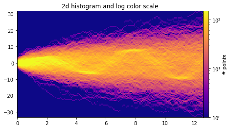
x_fine = np.matlib.repmat(x_fine, num_series, 1).flatten()Important! This data is simulated, and may just be random noise! 🔊
fig, axes = plt.subplots(figsize=(8, 4), constrained_layout=True)
cmap = copy(plt.cm.plasma)
cmap.set_bad(cmap(0))
h, xedges, yedges = np.histogram2d(x_fine, y_fine, bins=[400, 100])
pcm = axes.pcolormesh(xedges, yedges, h.T, cmap=cmap,
                         norm=LogNorm(vmax=1.5e2), rasterized=True)
fig.colorbar(pcm, ax=axes, label="# points", pad=0)
axes.set_title("2d histogram and log color scale");